It's constantly a work in progress because I am always looking for that perfect balance of red, aqua and crisp white. I'm very particular about the reds matching in there perfectly, and for the most part they do.

See the plain, boring lamp to the right of the bed? It's actually from PB Teen. I searched and searched for the perfect lamp to complement the one on the left side-and never found it! I settled for this one which I'm not in love with, but it does the trick. It's shorter than I thought it would be so I had to give it some height by sitting it on top of a metal container.
Anyway, I have been putting off covering the shade in fabric because I'm not quite sure what print I want to put on it. One thing I know-it NEEDS a print. I would love your opinions!
I have considered using the red background with white polka dot I used on the euro shams, only because I have a bit of it left over.
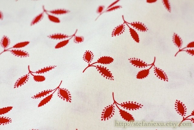
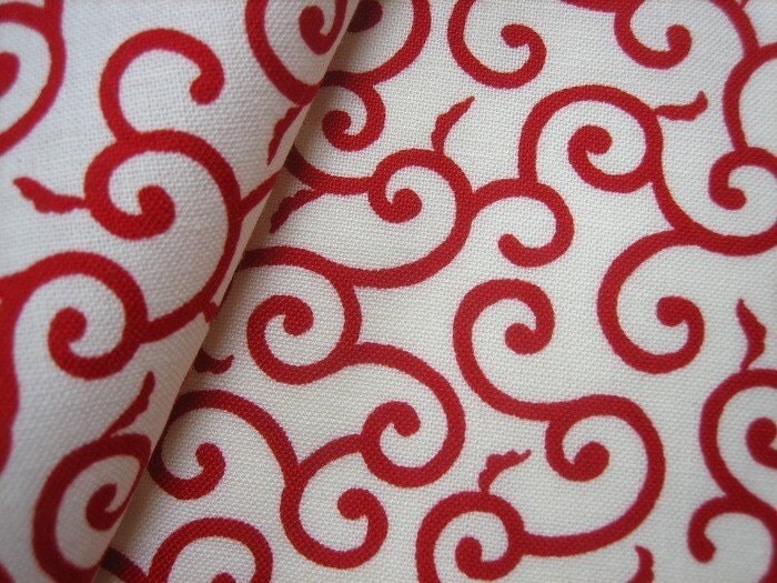
Here are some other options:

The white background is nice because it keeps the look of the shade light.


It's hard to tell on my computer monitor which red would work, so I will most likely need to order memo samples of whatever the final pick is-but I would love your input! Tell me which one you like the best, pleeeease! I know which one I'm leaning towards, but would really enjoy hearing what you think!


.png)